How-To
Viewing vimtop Data in a Spreadsheet
Monitor the health of your VMware vCenter Server Appliance by transforming it into a format that can be viewed in an Excel chart.
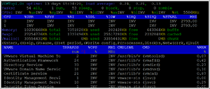
Vimtop is a useful tool to monitor the health of your VMware vCenter Server Appliance (VCSA) using real-time data (see Figure 1). Though real-time monitoring is helpful, sometimes you'll want to review this data within a different format, such as a graph or scatter plot, for historical context -- this is easy to accomplish and in this article I'll show you how to do it. If you're unfamiliar with vimtop in general, be sure to look at my two previous articles on vimtop: "How To Monitor a VCSA Using vimtop" and "How To Use Advanced Features of vimtop To Monitor VCSA."
 [Click on image for larger view.]
Figure 1. Real-time vimtop data.
[Click on image for larger view.]
Figure 1. Real-time vimtop data.
Capturing vimtop Data
The "-b" switch is used when starting vimtop to place it into batch mode; doing so streams data to the console rather than displaying it on the console. This data stream can be redirected to a file by using the ">" key. For example, "vimtop -b -c MemConfig -p 60 -n 15 > TOPMin.out.data" will capture vimtop data every 60 seconds (-p) for 30 iterations (-n) and redirect it (>) to a file called TOPMin.out.data. Because, by default, vimtop collects and emits a lot of data, I recommended that you set up a configuration file (-c) to limit the amount of data being collected. My previous vimtop articles (linked to earlier) mention how to set up a configuration file.
Transforming vimtop Data
The data output by vimtop consists of data iterations separated by the newline character. The first line consists of the names of the counters for which the data is being collected. Each subsequent line denotes an iteration of the data collected, so if you specify "-n 15" you'll have 16 lines of data, the first being the name of the counter and the rest being the data (Figure 2).
 [Click on image for larger view.]
Figure 2. Vimtop batch data.
[Click on image for larger view.]
Figure 2. Vimtop batch data.
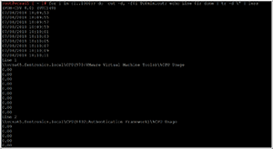
Once the data has been captured, it must then be transformed into a format that can be used by a spreadsheet. Following is code that will take a vimtop output file and display the name of the data, the associated values, as well as the data's position within the file (Figure 3) (note: the line number is for the data that precedes it):
for i in {1..1000}; do cut -d, -f$i TOPmin.out.data; echo Line $i; done | tr -d \" | less
 [Click on image for larger view.]
Figure 3. Transformed vimtop data.
[Click on image for larger view.]
Figure 3. Transformed vimtop data.
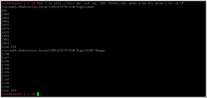
To extract a subset of this data, you can input the range of line numbers that you want to see in the output (Figure 4). For example, the following code extracts lines 131 and 132 from the vimtop data:
for i in {131..132}; do cut -d, -f$i TOPmin.out.data; echo Line $i; done | tr -d \" | less
 [Click on image for larger view.]
Figure 4. A subset of vimtop data.
[Click on image for larger view.]
Figure 4. A subset of vimtop data.
Creating a Chart
Due to the abbreviated nature of this article, I'll be cutting and pasting the data into a spreadsheet; however, it's a trivial matter to write code to format vimtop data to be read directly into a spreadsheet.
Although I'll be using Excel to create my spreadsheet chart for this example, most other spreadsheet software can create charts, as well, though the workflow will be slightly different for each.
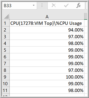
In this example, I will be charting a single value that I am interested in capturing: the percent of the CPU being consumed by the vimtop process. I displayed the values using the previous scripts and then cut and pasted them in my spreadsheet (Figure 5). I then modified the header by removing the name of the system that it come from, and changed the format of the field to display the numeric data as percentages rather than decimals.
 [Click on image for larger view.]
Figure 5. The vimtop data pasted into a spreadsheet format.
[Click on image for larger view.]
Figure 5. The vimtop data pasted into a spreadsheet format.
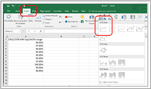
I then created a chart in Excel by selecting the data, clicking the Insert tab, and then selecting a "2-D Line" chart (Figure 6). Apart from this chart type, the only other type I found to work for this purpose is "X-Y Scatter."
 [Click on image for larger view.]
Figure 6. Creating a chart in Exchange with the vimtop data.
[Click on image for larger view.]
Figure 6. Creating a chart in Exchange with the vimtop data.
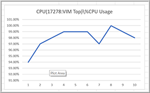
The chart that was created displayed the %CPU usage over the time frame specified (Figure 7).
 [Click on image for larger view.]
Figure 7. The chart created in Excel.
[Click on image for larger view.]
Figure 7. The chart created in Excel.
Wrapping Up
Vimtop is a valuable tool that you can use to monitor the real-time health of your VCSA. By capturing vimtop data using the methods outlined in this article, however, you can get a more holistic historical view of what your VCSA is doing in order to more proactively identify trends and address pressing concerns before they become more serious issues down the line.
About the Author
Tom Fenton has a wealth of hands-on IT experience gained over the past 30 years in a variety of technologies, with the past 20 years focusing on virtualization and storage. He currently works as a Technical Marketing Manager for ControlUp. He previously worked at VMware in Staff and Senior level positions. He has also worked as a Senior Validation Engineer with The Taneja Group, where he headed the Validation Service Lab and was instrumental in starting up its vSphere Virtual Volumes practice. He's on X @vDoppler.