How-To
How To Use the AWS Service Health Dashboard
Because things can go wrong with the cloud service, an easy way to determine where the problem is occurring is to use the Service Health Dashboard.
Although Amazon Web Services (AWS) is generally reliable, things can and occasionally do go wrong with the service. When that happens, administrators must be able to determine whether the problem is on the AWS end, or if the problem is related to something that's within the administrator's control. One of the best sources of information in these situations is the Service Health Dashboard.
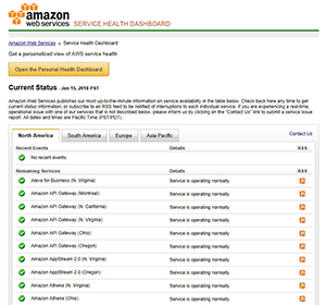
The Service Health Dashboard is relatively well hidden within the AWS interface. You won't find it on the list of services. One way of accessing the Service Health Dashboard is to simply enter the word Health into the search box. Another option is to log into the AWS console, and then enter the Service Health Dashboard's URL: http://status.aws.amazon.com. You can see what the Service Health Dashboard looks like in Figure 1.
 [Click on image for larger view.]
Figure 1. The AWS Service Health Dashboard.
[Click on image for larger view.]
Figure 1. The AWS Service Health Dashboard.
As you can see in the figure, the top portion of the Service Health Dashboard lists the various AWS services by region, along with an indication of the service's health. In this case, everything is functioning normally.
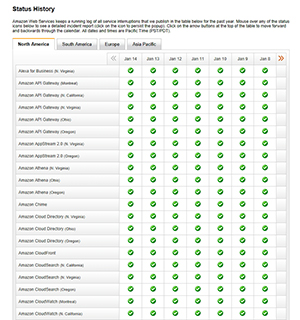
If you scroll further down the page, you'll find the Status History section, which you can see in Figure 2. Like the Current Status section, this section lists each of the AWS services. However, this section allows you to see if any service health problems have recently occurred. In this particular case, everything appears to have been healthy over the last few days.
 [Click on image for larger view.]
Figure 2. None of the services are reporting recent health problems.
[Click on image for larger view.]
Figure 2. None of the services are reporting recent health problems.
One thing you're sure to notice with these lists is that Current Status and Status History both provide an overwhelming amount of information. One way that you can make the health information a bit easier to digest is by using a Personal Health Dashboard.
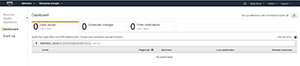
If you look back at Figure 1, you'll notice that the interface contains a big yellow button labeled Open Personal Health Dashboard. You can see what the Personal Health Dashboard looks like in Figure 3.
 [Click on image for larger view.]
Figure 3. The Personal Health Dashboard.
[Click on image for larger view.]
Figure 3. The Personal Health Dashboard.
As you initially look at this screen, it may seem a bit underwhelming. However, that's mostly because no issues have recently been reported. Even so, let's go ahead and explore the dashboard's contents.
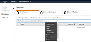
As you can see in the Figure 3, the most prominent feature of the Personal Health Dashboard is the series of tabs that runs along the top of the screen. These tabs allow you to view open issues from the last seven days, scheduled changes and any other notifications from the last seven days. It's worth noting that these tabs automatically refresh every minute or two, so the information displayed should be relatively current.
In Figure 3, the Open Issues tab is selected. Although there aren't any issues to report, you can see that the lower portion of the screen would display the event, region, start time, last update time and any affected resources.
Another thing that's worth taking a look at on this screen is that just above the empty list of events is a box that says Start Time. This box is actually a filter. By default, the list is being filtered by start time, but you can filter the list based on other criteria such as availability zone, service or region. You can see some of the available filters in Figure 4.
 [Click on image for larger view.]
Figure 4. There are a number of filters available.
[Click on image for larger view.]
Figure 4. There are a number of filters available.
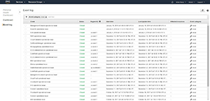
Keep in mind that you don't have to view the list in a filtered format. Filtering usually makes it easier to parse the information and find exactly what you're looking for, but it is possible to see a full, unabridged list of issues instead. To do so, click the See All Issues link, shown in Figure 5 (or just click on the Event Log).
 [Click on image for larger view.]
Figure 5. The Event Log shows you all recent issues.
[Click on image for larger view.]
Figure 5. The Event Log shows you all recent issues.
As you browse the Event Log, you can use filtering to narrow down the list of issues. In Figure 4, for example, the list was filtered by event category. In this case, events with a category equal to Issues are displayed. You can revise this filter, or filter on a different set of criteria.
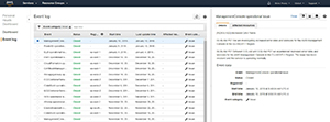
If you want to see more information about a particular issue, simply click on the item within the list. The right side of the screen will display detailed information about the issue, as well as its status and when the issue began and ended. As you can see in Figure 6, there's also a tab that you can use to determine which resources were affected by the issue.
 [Click on image for larger view.]
Figure 6. You can view detailed information related to each issue.
[Click on image for larger view.]
Figure 6. You can view detailed information related to each issue.
By and large, AWS is stable and reliable. However, if you ever do experience problems, the Service Health Dashboard is a great place to begin your troubleshooting efforts.
About the Author
Brien Posey is a 22-time Microsoft MVP with decades of IT experience. As a freelance writer, Posey has written thousands of articles and contributed to several dozen books on a wide variety of IT topics. Prior to going freelance, Posey was a CIO for a national chain of hospitals and health care facilities. He has also served as a network administrator for some of the country's largest insurance companies and for the Department of Defense at Fort Knox. In addition to his continued work in IT, Posey has spent the last several years actively training as a commercial scientist-astronaut candidate in preparation to fly on a mission to study polar mesospheric clouds from space. You can follow his spaceflight training on his Web site.