How-To
How To Create Gauge Charts
Another useful way to display log data.
After writing articles on how and why to use bubble charts and overlay charts to display log data, I thought that it would be useful to share with you why you'd want to use a gauge chart and how to create one using vRealize Log Insight.
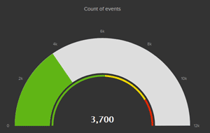
Gauge charts are a little different than most other charts in three ways: 1) they use a dial to display values, 2) they use colors to indicate when the data set values are in various states, and 3) they don't display the data in a time-based manner. An example of a gauge chart is shown in Figure 1 .
 [Click on image for larger view.]
Figure 1. A sample gauge chart.
[Click on image for larger view.]
Figure 1. A sample gauge chart.
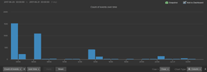
Using gauge charts makes it very easy to identify, with very little interpolation, when something needs to be examined. For example, although a gauge chart and a column chart (Figure 2) both use the same data set, the gauge chart makes it apparent to even a casual observer that everything is fine; the bar chart, on the other hand, requires you to interrupt the data and then make a judgment call, based on past experience, that something is amiss.
Gauge charts are not a universal solution for data display, and there are tradeoffs in using them. For instance, you must predefine the limits at which the gauge will enter the various color indicators, and it isn't a useful tool to observe data trends over time.
 [Click on image for larger view.]
Figure 2. A sample column chart.
Creating a Gauge Chart
[Click on image for larger view.]
Figure 2. A sample column chart.
Creating a Gauge Chart
Although gauge charts aren't as universally popular as some of the other chart types, many modern log collectors allow you to create gauge charts. If yours doesn't, you can export collected log data and use another application, such as a spreadsheet, to create and display gauge charts.
As with my bubble chart and overlay chart articles, I'll use VMware vRealize Log Insight (vRLI) to demonstrate how to create a gauge chart. I'll use the same data set I used in the bubble chart article for this article: a log of failed login attempts.
 [Click on image for larger view.]
Figure 3. Creating a new field to track invalid users.
[Click on image for larger view.]
Figure 3. Creating a new field to track invalid users.
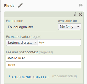
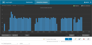
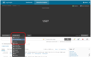
As with my overlay chart, I created a new field to track the events fields which include the phrase "invalid user" (Figure 3). After creating this field, I created a filter to graph all the events that contained this new field (Figure 4 ). The X-axis of the chart represents time and the Y-axis of the chart contains the number of log entries in which "invalid user" appears.
 [Click on image for larger view.]
Figure 4. Filtering for invalid users.
[Click on image for larger view.]
Figure 4. Filtering for invalid users.
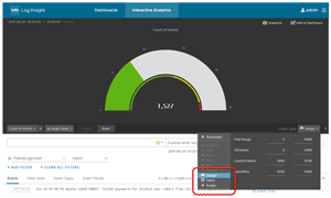
To display this data in a gauge chart, I first displayed the total number of failed login attempts as a single value by changing the chart from a "Time Series" to a "Non-Time Series" chart. I accessed this option from the "Group By" dropdown menu (Figure 5).
 [Click on image for larger view.]
Figure 5. Creating a "Non-time series" chart.
[Click on image for larger view.]
Figure 5. Creating a "Non-time series" chart.
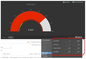
I then changed the chart type from "Automatic" to "Gauge" (
Figure 6), then adjusted the color indicators so that the gauge would be green if 0-250 events took place, yellow if 250–500 events took place, and red if more than 500 events took place within an hour (
Figure 7).
 [Click on image for larger view.]
Figure 6. The new gauge chart.
[Click on image for larger view.]
Figure 6. The new gauge chart.
The gauge chart now displays the number of failed login attempts in the last hour as a numerical value, and also as a color indicator to show the range in the number of events.
 [Click on image for larger view.]
Figure 7. The color-coded range chart. In this case, red shows a high number of failed login attempts.
[Click on image for larger view.]
Figure 7. The color-coded range chart. In this case, red shows a high number of failed login attempts.
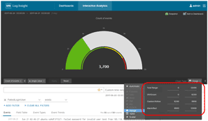
Changing the time range to a wider value will also change the color indicator ranges. To demonstrate this, I changed the value from one hour to one day. In Figure 8, the gauge is now green since a smaller percentage of events were recorded over a 24-hour time frame than in a one-hour time period.
 [Click on image for larger view.]
Figure 8. The longer range, 24-hour gauge chart.
[Click on image for larger view.]
Figure 8. The longer range, 24-hour gauge chart.
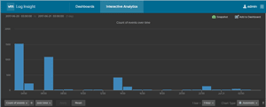
Figure 9 shows the 24-hour time period as a time-based column chart, rather than a single-value gauge chart. When the data is displayed as time-based, it becomes apparent that there were some spikes of failed logins during the last 24 hours; this isn't available in the gauge chart.
 [Click on image for larger view.]
Figure 9. The same data as in Figure 8, but displayed in a 24-hour column chart.
[Click on image for larger view.]
Figure 9. The same data as in Figure 8, but displayed in a 24-hour column chart.
Gauge charts are a useful way to display data so you can recognize critical conditions. However, their limitations should recognized. Remember that they don't supply a time-based historical record of that data.
About the Author
Tom Fenton has a wealth of hands-on IT experience gained over the past 30 years in a variety of technologies, with the past 20 years focusing on virtualization and storage. He previously worked as a Technical Marketing Manager for ControlUp. He also previously worked at VMware in Staff and Senior level positions. He has also worked as a Senior Validation Engineer with The Taneja Group, where he headed the Validation Service Lab and was instrumental in starting up its vSphere Virtual Volumes practice. He's on X @vDoppler.