How-To
How To Display Log Data Using Overlay Charts
Another way to monitor your datacenter environment.
In my previous article, "How To Display Log Data Using Bubble Charts," I explained how bubble charts can be a convenient and useful tool for monitoring a datacenter. Equally useful for monitoring a datacenter are overlay charts, which allow you to coordinate, compare and display multiple events on the same chart. This article will outline what an overlay chart is, then demonstrate how to create one.
An overlay chart displays two sets of data, with one on top of the other. Displaying the data this way makes it easy to visually identify events that coincide with one another and quickly determine if a correlation or relationship exists between them. Remember that correlation does not necessary imply causation; but theorizing based on the data displayed on an overlay chart can justify further investigation in an effort to discover the root cause of an issue.
An overlay chart displays two values that share a common axis, which is usually the X-axis; the Y-axis is unique to each of the data sets. For example, you can use an overlay chart to display two events over time, such as disk errors and disk temperatures. In this case, by displaying data on an overlay chart, we can visually determine if these two values (disk corrections and disk temperatures) coincide with one another.
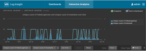
Another example of two values you could measure with an overlay chart are the number of failed server login attempts and the number of servers from which the attempts were made, which is shown in Figure 1. This is a useful chart for quickly monitoring datacenter security and determining if your server has been compromised.
 [Click on image for larger view.]
Figure 1. An example of a typical overlay chart.
For this example I’ll use VMware vRealize Log Insight (vRLI) to demonstrate building an overlay chart. You don’t have to use vRLI, though; most modern log collectors will allow you to create overlay charts.
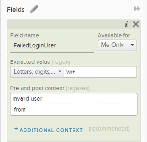
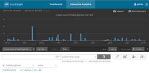
First I created a new field to track the events fields that included the phrase "invalid user" (Figure 2). After creating this field, I created a filter to graph all the events containing this new field (Figure 3 ). The X-axis of the chart is the time and the Y-axis of the chart shows the number of unique names in events where an invalid user appears.
 [Click on image for larger view.]
Figure 2. Creating a new field to track events including the string "Invalid user".
 [Click on image for larger view.]
Figure 3. Creating a filter to graph events containing the string from Figure 2.
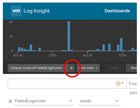
To display this data in an overlay chart, I selected the "+" sign to the right of "Unique count of FailedLoginUser" (Figure 4) to add a second Y-axis to the chart.
 [Click on image for larger view.]
Figure 4. Adding a second Y-axis to the chart.
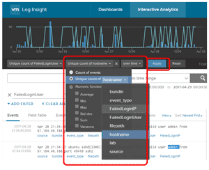
I then specified that the second Y-axis should display a unique hostname count. After clicking "Apply," a new line chart was displayed over the existing bar chart (Figure 5).
 [Click on image for larger view.]
Figure 5. The new chart showing the secondary Y-axis.
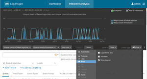
The chart now displays the number of unique login names as a bar chart and the number of unique hosts as a line chart; it also has a scale on the right and left sides of the chart, as well as a legend on the right side. I then changed the first Y-axis to an area chart type (Figure 6).
 [Click on image for larger view.]
Figure 6. Creating an area chart.
The reason I chose to measure these two sets of data in overlay chart form was because one of my systems was exposed to the outside world. By using this chart, I could easy track the number of hosts reporting invalid logins over time. An increase in this number will usually be an indication that my lab has been compromised. Being able to monitor these events on an overlay chart is a convenient way for me to track security in my datacenter, and act quickly if I ever notice something suspicious.
(A final note of caution: avoid using overlay charts to determine causation between two events, as this is an example of the post hoc ergo propter hoc (Latin: "After this, therefore because of this") logical fallacy. Just because event Y coincides with event X, event Y is not necessarily caused by event X; a correlation or relationship between two events can certainly exist without causation.)
About the Author
Tom Fenton has a wealth of hands-on IT experience gained over the past 30 years in a variety of technologies, with the past 20 years focusing on virtualization and storage. He previously worked as a Technical Marketing Manager for ControlUp. He also previously worked at VMware in Staff and Senior level positions. He has also worked as a Senior Validation Engineer with The Taneja Group, where he headed the Validation Service Lab and was instrumental in starting up its vSphere Virtual Volumes practice. He's on X @vDoppler.