How-To
How To Display Log Data Using Bubble Charts
Visualizing data as bubbles may alert you to issues you've missed.
Most modern log collectors and analyzers have the ability to create advanced charts, and one of the most interesting is the bubble chart. Bubble charts are important because they make it extremely easy to visualize complex data queries and, as a result, quickly identify potential system abnormalities. A bubble chart displays three data values: the first two are the familiar X and Y axes, while the third is visually implied through the size of each bubble on the chart.
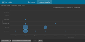
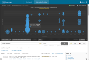
How can they be useful? Take the example of displaying the failed login attempts on a Linux server. The X axis would have the source IP address of the login attempt, and the Y-axis would have the user's name. The size of each bubble would indicate the relative volume of login attempts. Thus, the more attempts made using a user ID made from an IP address, the larger a particular bubble will be. A bubble chart will make it readily apparent to even the most casual of observers that something is amiss. Figure 1 displays a bubble chart using these three data values.
 [Click on image for larger view.]
Figure 1. A bubble chart showing login attempts.
[Click on image for larger view.]
Figure 1. A bubble chart showing login attempts.
As mentioned earlier, most modern log collectors can be used to create bubble charts. For this article, I'll use VMware vRealize Log Insight (vRLI) to create a bubble chart. The right to use vRLI, in a limited fashion, is included with most vCenter licenses, and is easy to install. If you don't have vRLI, other log collectors and analyzers should follow a similar methodology to create bubble charts from your logs.
(A word of caution: despite the fact that bubble charts can be an extremely useful and convenient tool for monitoring datacenter security, the example here should be taken as just that; an example of how to create a bubble chart, and not an end-all solution for monitoring the security in your datacenter. That said, you may want to use it as a starting point, after thoroughly vetting it and modifying it for fit and use in your datacenter, to help monitor login attempts.)
The data for this example was from a Linux server that had port 22 opened; it was under a brute force attack to try and guess a username and password on the server.
Creating the Chart
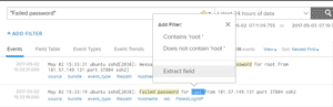
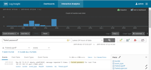
The first thing I did was search for all events containing the phrase "Failed password" in the last 24 hours. I created two new fields in the events that I'd be using for the X and Y axis data. Creating new fields is accomplished in vRLI by highlighting a word or phrase and selecting "Extract field" (
Figure 2), and creating the regex parameters that describe the field.
 [Click on image for larger view.]
Figure 2. Creating new fields using "Extract field."
[Click on image for larger view.]
Figure 2. Creating new fields using "Extract field."
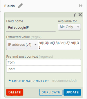
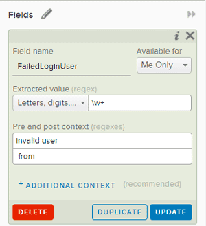
I won't go into the exact steps to create a new field, as this is documented in the official vRLI documentation. The parameters I used to create the two new fields, "FailedLoginIP" and "FailedLoginUser," are shown in Figure 3 and Figure 4.
 [Click on image for larger view.]
Figure 3. Creating the IP address field.
[Click on image for larger view.]
Figure 3. Creating the IP address field.
 [Click on image for larger view.]
Figure 4. Creating the User ID field.
[Click on image for larger view.]
Figure 4. Creating the User ID field.
After the new fields were created, I filtered for all the events that had the "FailedLoginIP" field (Figure 5). Although this step isn't completely necessary, as I already had a filter in place, I like to use it as a sanity check to make sure the created field is actually selecting the correct items that I believe it is.
 [Click on image for larger view.]
Figure 5. Filtering for the "FailedLoginIP" attempts.
[Click on image for larger view.]
Figure 5. Filtering for the "FailedLoginIP" attempts.
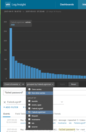
After filtering the events, I created a non-time series chart grouped by the field "FailedLoginUser" (Figure 6). Each column in this chart shows the total number of failed login attempts for a paticular user ID.
 [Click on image for larger view.]
Figure 6. Grouping results by "FailedLoginUser."
[Click on image for larger view.]
Figure 6. Grouping results by "FailedLoginUser."
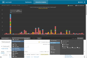
By further grouping the events by "FailedLoginIP" (Figure 7), I displayed a nice stacked chart where each color on the column indicates a different user ID. Pointing to a particular color in a column will display the user ID, the IP and the number of attempts that the login failed.
 [Click on image for larger view.]
Figure 7. Grouped by "FailedLoginIP."
[Click on image for larger view.]
Figure 7. Grouped by "FailedLoginIP."
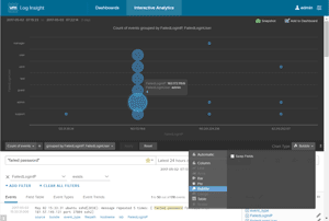
At this point, I only needed to select "Bubble" from the chart types to create a bubble chart (Figure 8). The user IDs are shown on X-axis and the IP addresses are shown on the Y-axis, with the visually apparent size of the bubble indicating the relative number of failed attempts that were made from a particular IP address under a particular username. As with the stacked column chart, one can get more information about a bubble by pointing to it.
 [Click on image for larger view.]
Figure 8. The same information as Figures 6 and 7, but in bubble chart format.
[Click on image for larger view.]
Figure 8. The same information as Figures 6 and 7, but in bubble chart format.
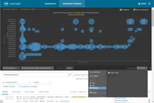
I had been using the last 24 hours of data for the charts so far, but once I changed the time range to include the last month of data, the density of bubbles on the chart increased (Figure 9). Even though a lot more data was displayed, however, I could still easily identify the user IDs and IP addresses that had an excessive amount of failed login attempts. I then swapped the X and Y axes to get a slightly different view of the data (Figure 10).
 [Click on image for larger view.]
Figure 9. Displaying a month's worth of data.
[Click on image for larger view.]
Figure 9. Displaying a month's worth of data.
 [Click on image for larger view.]
Figure 10. A different view of the same data, with the X and Y axes switched.
Going Further
[Click on image for larger view.]
Figure 10. A different view of the same data, with the X and Y axes switched.
Going Further
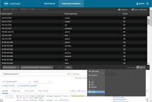
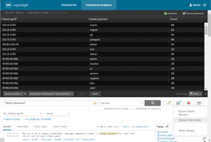
Once I had the three values of data identified and displayed, I chose to display it as a table rather than a bubble chart (
Figure 11), which made the grouped failed logins information easy to arrange by value, with the IP address and username with the most failed attempts appearing at the top of the list. I then exported this data from vRLI as an Excel CSV file (
Figure 12) and viewed it as a spreadsheet (
Figure 13).
 [Click on image for larger view.]
Figure 11. The information displayed as a table.
[Click on image for larger view.]
Figure 11. The information displayed as a table.
 [Click on image for larger view.]
Figure 12. Exporting the data as a CSV file.
[Click on image for larger view.]
Figure 12. Exporting the data as a CSV file.
 [Click on image for larger view.]
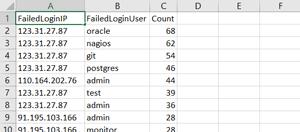
Figure 13. The data in an Excel spreadsheet.
[Click on image for larger view.]
Figure 13. The data in an Excel spreadsheet.
As this is information I'd like to examine on a daily basis, I created a custom vRLI dashboard (Figure 14) to display the charts I created.
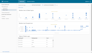 [Click on image for larger view.]
Figure 14. A customized vRLI dashboard, showing the login results on a daily basis.
[Click on image for larger view.]
Figure 14. A customized vRLI dashboard, showing the login results on a daily basis.
In this article, I've demonstrated how I created a bubble chart using two new event fields, which made it extremely easy for me to identify abnormal patterns of failed login activities on one of my Linux servers. Although I used vRealize Log Insight for this particular example, many other log collectors and analyzers have the ability to create bubble charts which allow you to display three different values in a single chart.
This is just a simple example, and not meant for enterprise work. But it may be a good starting point, and, with further refinement, could become a tool you use on a daily basis in your datacenter.